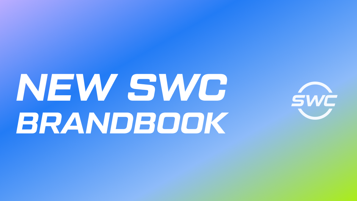
With the transition to a new stage of development, SWC will undergo a landmark rebranding of the company. 2022 was a transformational year for Sky World Community: key strategic directions were defined, a new Adaptation and Training Platform was released, the company's organizational structure was formed, the transformation of the SWC community was launched, the strongest professionals in recruitment, marketing, sales, community building, IT joined the team; and other qualitative transformations occured.

«The minimalist and self-sufficient logo emphasises the idea of developing humanity's green technologies, as well as the vision for the SWC's movement in the future. The lower arc is the Earth. Only the sky is higher. That is why the SWC logo is in the middle: the sky-level logo represents the high level of standards and services of SWC, the next generation international financial and social platform. But the sky isn't the limit either. The top arc on the logo symbolises space. SWC plans to grow steadily and climb ever higher in the international investment field. We are confident that SWC will reach a whole new level of development through the commercialisation of Anatoli Eduardovich Unitsky's string transport technology. Then, when requested and enabled, we will be able hopefully to move on to support a more global and ambitious the GPV programme for near space exploration. Also, of course, the sphere in the logo concept identifies the World Community, that is, the international community on the planet Earth; — revealed the semantic part of the logo Alexey Sukhodoyev, representative of the SWC Board.

The colour palette emphasises the three pillars of the SWC platform ecosystem.
Blue simultaneously symbolises innovation, the investment product, and the IT platform. The company is now working with partners and investors on 15 stages of UST financing to meet commitments to investors. The implementation of the stages is based on sophisticated IT solutions — continuous improvement of the personal office, mobile app, analytics, marketing tools of the SWC social-financial platform.
The educational aspect is brought by the purple colour. Partner training and the new Adaptation and Training Platform play a key role here. It is an incubator of competencies and professions, primarily from practitioners within the SWC community, and secondly, from the best specialists from the training market both Russian and foreign. Through training, SWC turns newcomers who share the company's values and strive to self-develop themselves and turn into new generation professionals for the development of the SWC directions that improve the quality of human life, the environment, as well as advance infrastructure and create new business areas.
The social aspect is reflected in green color. This is the direction of the SWC community, the community as a separate product. Social capital is one of the most important assets of SWC. Historically, SWC is financing eco-oriented technologies. Environmental friendliness of solutions and interactions plays a key role in the evolution of the company and the SWC team. It is also embedded in the current SWC community transformation program with using social mechanics, gamification, automation, engagement tools, target audience criteria, principles, values, and new roles of community members. The environmental friendliness of the SWC community is emphasized in the green color of the palette.

«The new reinterpreted brandbook is the visual embodiment of our meanings, values, development strategy. It is designed in the logic of a complete transformation of the company in accordance with the new and upcoming challenges of the time. We are not changing the concept, it has been under creation for years, we are not changing the name. We are proud to leave the Sky as its part. This is part of our philosophy, our long journey and future successful history on the global scale. “Sky” embodies high standards of quality of service provision, service at a professional level “at the sky level ”. And only space is higher than the sky, which is what we are striving for in the long-term development program», — added Alexey Sukhodoyev.
The process of full rebranding of all material resources will be implemented gradually in accordance with the rebranding roadmap. In the future, all communications and interactions within SWC and on behalf of SWC to the external market and resources will be released exclusively in the style of the new brandbook. The new rules will be published in the partners' personal office.

